Generate GCP Data Analytics Diagrams from Text
Describe your Google Cloud data pipeline in plain English. Get a valid Draw.io diagram with BigQuery, Dataflow, Pub/Sub, and Looker components using official GCP icons.
This GCP data analytics diagram generator turns plain-text pipeline descriptions into Draw.io diagrams with official Google Cloud icons for BigQuery, Dataflow, Pub/Sub, Cloud Storage, Dataproc, and Looker. Describe a pipeline where Cloud Storage buckets in us-central1 land raw Avro files, a Cloud Composer DAG triggers a Dataflow batch job running Apache Beam transforms, the cleaned output loads into a BigQuery partitioned dataset, and Looker dashboards query the warehouse through authorized views. The AI maps each service to its canonical GCP icon, draws directional data flow arrows with format annotations, and groups components by pipeline stage. Every element snaps to a 10px grid per RULE-04. Architecture warnings flag single-region storage (WARN-01) and pipelines missing error handling sinks (WARN-05). Output is native .drawio XML.
What Is a GCP Data Analytics Diagram?
A GCP data analytics diagram maps data flow from ingestion through transformation to consumption across Google Cloud services. Pipelines typically start with Cloud Storage as a data lake or Pub/Sub for streaming, run transformations through Dataflow (Apache Beam) or Dataproc (Apache Spark), land results in BigQuery, and serve insights through Looker. Drawing these manually means placing icons for each service, routing arrows between stages, and labeling data formats and throughput. An AI GCP data analytics diagram generator handles this from a text prompt. Describe 'Pub/Sub topic orders-stream receives 50K messages per second. Dataflow streaming job with autoscaling workers parses JSON, enriches with customer data from Cloud SQL via side input, writes to BigQuery time-partitioned table orders_enriched clustered on customer_id. Cloud Composer 2 DAG runs nightly to execute Dataform SQL workflows building aggregate tables. Looker connects via BigQuery authorized views.' Diagrams.so selects official GCP icons from its 30+ icon libraries. RULE-06 groups components by pipeline stage: ingestion, processing, storage, serving. RULE-05 enforces left-to-right data flow so the pipeline reads naturally from source to dashboard. Opinionated mode locks this layout. VLM visual validation catches overlapping labels on multi-branch pipelines. WARN-01 fires when all storage and compute sit in a single region. WARN-03 triggers for BigQuery datasets without cross-region replication. WARN-05 flags vague names like 'data processor' instead of specific service references. The output is native .drawio XML. Version-control it alongside Dataform definitions and Terraform configs.
Key components
- Cloud Storage buckets with lifecycle rules, storage classes (Standard, Nearline), and regional placement labels
- Pub/Sub topics and subscriptions with throughput annotations and dead-letter topic configurations
- Dataflow jobs (batch and streaming) with Apache Beam pipeline labels, worker counts, and autoscaling ranges
- BigQuery datasets with table partitioning schemes (time-based, integer-range) and clustering column annotations
- Dataproc clusters with Spark job type labels, autoscaling policies, and component gateway details
- Cloud Composer 2 environments showing DAG orchestration arrows connecting pipeline stages
- Dataform SQL workflow boxes with dependency arrows between staging, intermediate, and output tables
- Looker and Looker Studio connections through BigQuery authorized views with row-level security labels
How to generate with AI
- 1
Describe your data pipeline
Write your GCP analytics pipeline in plain English. Be specific about services, regions, and data formats. For example: 'Cloud Storage bucket raw-events-prod in us-central1 receives gzipped JSON files from an on-prem SFTP transfer every 15 minutes. Cloud Composer 2 DAG detects new files and launches a Dataflow batch job using the Apache Beam Python SDK. The job parses JSON, validates schema against a BigQuery table definition, filters invalid records to a quarantine bucket, and loads clean records into BigQuery dataset analytics_prod table events_daily partitioned by event_date. Dataform runs downstream SQL models nightly.'
- 2
Select GCP and data pipeline options
Set cloud provider to GCP and diagram type to Data Pipeline. Diagrams.so loads official Google Cloud icons covering Cloud Storage, Pub/Sub, Dataflow, BigQuery, Dataproc, Cloud Composer, Dataform, Looker, and Cloud SQL. Enable opinionated mode to enforce left-to-right data flow layout with automatic grouping by pipeline stage: ingestion on the left, transformation in the center, warehouse and serving on the right.
- 3
Generate and validate
Click generate. The AI produces a .drawio XML file with GCP icons, data flow arrows labeled with formats and throughput, and pipeline stage groupings. Architecture warnings flag single-region deployments (WARN-01), BigQuery datasets without backup or replication strategies (WARN-03), and ambiguously named components (WARN-05). VLM visual validation detects overlapping labels on multi-branch pipelines. Download as .drawio, PNG, or SVG.
Example prompt
GCP data analytics platform for an e-commerce company: Cloud Storage bucket raw-clickstream-prod in us-central1 receives 200GB of gzipped JSON clickstream data daily from Google Tag Manager server-side containers. Pub/Sub topic order-events receives real-time order events at 10K messages per second from Cloud Run microservices. Streaming path: Dataflow streaming job reads from Pub/Sub, sessionizes events by user_id with 30-minute gap windows, enriches with product catalog data from Cloud SQL PostgreSQL via side input, writes to BigQuery table orders_realtime partitioned by order_date and clustered on region and product_category. Batch path: Cloud Composer 2 DAG triggers nightly at 02:00 UTC, launches Dataflow batch job to process clickstream files from Cloud Storage, joins with BigQuery orders_realtime table, outputs to BigQuery dataset analytics_prod tables user_sessions and product_funnel. Dataform project runs after batch completion to build aggregate models: daily_revenue, cohort_retention, product_attribution. Dataproc Serverless runs weekly Spark ML job for customer segmentation writing results to BigQuery ml_features dataset. Looker connects to analytics_prod via authorized views with row-level security by region. Data Catalog tags PII columns in all datasets.
Example diagrams from the gallery


GCP BigQuery Pipeline vs AWS Redshift Pipeline vs Azure Synapse Pipeline
All three cloud providers offer managed data warehouse pipelines, but they differ in architecture, pricing model, and orchestration approach. BigQuery separates storage and compute with on-demand or slot-based pricing. Redshift uses provisioned clusters or Serverless with RPU-based scaling. Synapse combines dedicated SQL pools with serverless SQL and Spark pools in one workspace.
| Feature | GCP BigQuery Pipeline | AWS Redshift Pipeline | Azure Synapse Pipeline |
|---|---|---|---|
| Ingestion layer | Pub/Sub for streaming, Cloud Storage for batch; Dataflow (Apache Beam) handles both with a unified SDK | Kinesis Data Streams for streaming, S3 for batch; Glue ETL (Spark) or Kinesis Data Firehose for loading | Event Hubs for streaming, Blob Storage for batch; Synapse Pipelines (ADF-based) with mapping data flows |
| Transformation engine | Dataflow for ETL, Dataform for ELT SQL models inside BigQuery, Dataproc for heavy Spark workloads | Glue ETL with Spark or Python shell jobs, dbt on Redshift for SQL models, EMR for Spark at scale | Synapse Spark pools for ETL, dedicated or serverless SQL pools for ELT, mapping data flows for no-code transforms |
| Warehouse pricing model | On-demand at $6.25/TB scanned or flat-rate slots at $0.04/slot-hour; storage at $0.02/GB active per month | Provisioned nodes (dc2, ra3) or Serverless at RPU-hours; S3 managed storage at $0.024/GB per month for ra3 | Dedicated SQL pool DWUs billed per hour, or serverless SQL at $5/TB processed; Spark pool charged per vCore-hour |
| Orchestration | Cloud Composer 2 (managed Airflow) with native BigQuery and Dataflow operators; Workflows for simple sequences | Step Functions for workflow orchestration, MWAA (managed Airflow) for complex DAGs, EventBridge for scheduling | Synapse Pipelines built on ADF with triggers, tumbling windows, and dependency chaining; Logic Apps for events |
| BI and serving layer | Looker with LookML semantic layer, Looker Studio for self-service; BigQuery BI Engine for sub-second cached queries | QuickSight with SPICE in-memory engine; Redshift data sharing for cross-cluster queries without data movement | Power BI with DirectQuery to Synapse dedicated pools; Azure Analysis Services for OLAP semantic models |
| Data governance | Data Catalog for metadata, column-level security policies, BigQuery column-level encryption and policy tags for PII masking | Lake Formation for fine-grained access, Glue Data Catalog for metadata, Redshift row-level and column-level security | Purview for metadata lineage and classification, Synapse column-level security, dynamic data masking on dedicated pools |
When to use this pattern
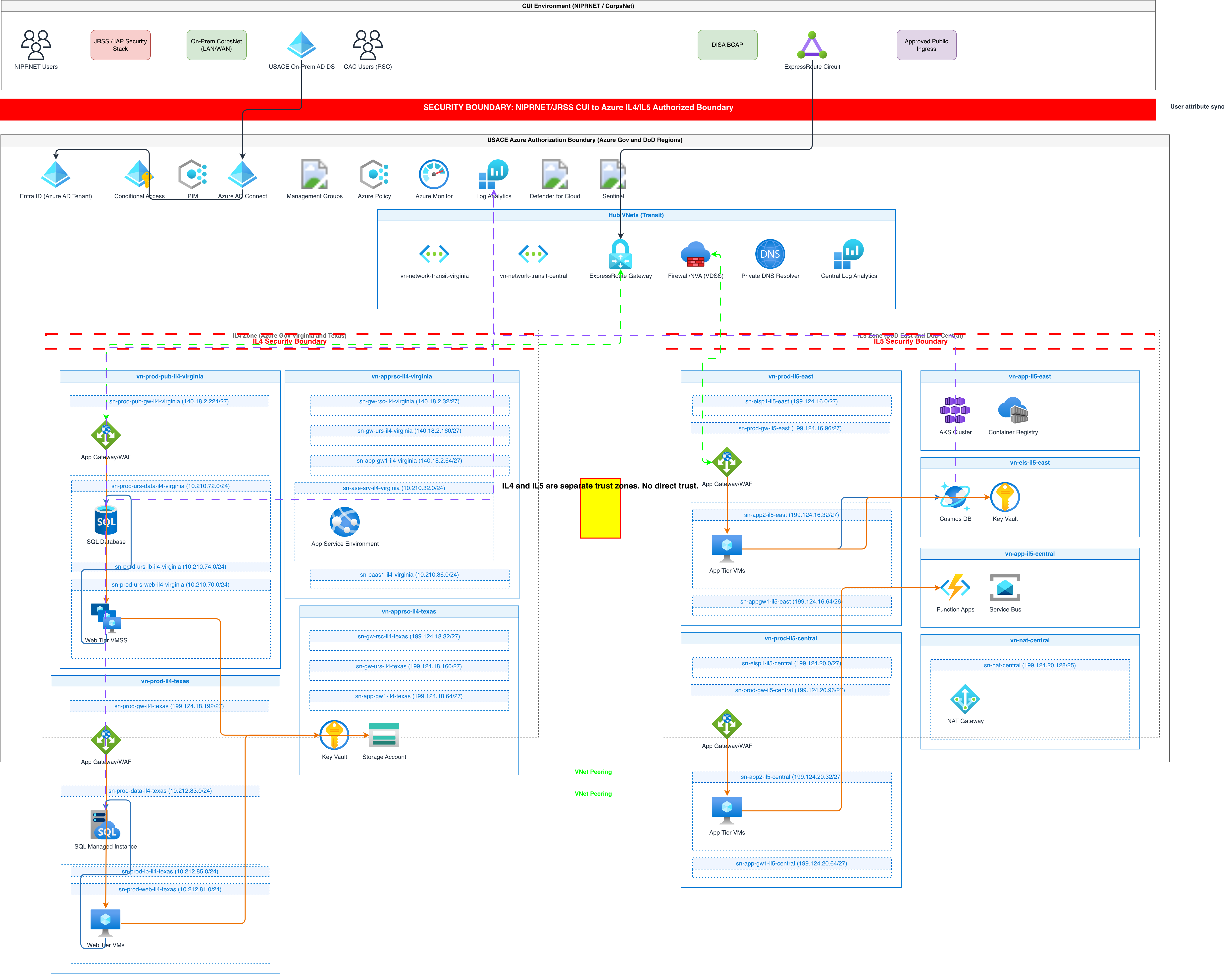
Use a GCP data analytics diagram when you're designing or documenting a data pipeline that spans multiple Google Cloud services from ingestion to BI. It's the right choice for architecture reviews before building new Dataflow jobs, cost estimation discussions comparing BigQuery on-demand versus flat-rate slots, and onboarding data engineers who need to trace data lineage across Cloud Storage, Dataflow, and BigQuery. If your pipeline runs entirely within BigQuery using scheduled queries and Dataform, you still benefit from diagramming the table dependency graph. For architectures spanning multiple clouds, start with a general cloud architecture diagram and add GCP-specific detail in a separate view. If you're focused on Kubernetes-based data processing with Spark on GKE, a Kubernetes diagram captures that better.
Frequently asked questions
What GCP data services does the diagram generator support?
This GCP data analytics diagram generator supports Cloud Storage, Pub/Sub, Dataflow, BigQuery, Dataproc, Cloud Composer, Dataform, Looker, Looker Studio, Cloud SQL, Firestore, Data Catalog, and BigQuery ML. Each service renders with its official GCP icon from the 30+ icon libraries. Specify services explicitly in your prompt for precise icon placement.
Can I show both streaming and batch paths in one diagram?
Yes. Describe both paths in your prompt: 'Pub/Sub feeds a Dataflow streaming job for real-time inserts while Cloud Composer triggers nightly batch Dataflow jobs from Cloud Storage.' The AI renders parallel pipeline branches with labeled arrows distinguishing streaming throughput from batch schedules. RULE-06 groups each path into a labeled container.
How does the AI represent BigQuery partitioning and clustering?
Mention partitioning and clustering in your prompt. The AI annotates BigQuery table icons with partition column, partition type (time-based daily or integer-range), and clustering columns. For example, 'partitioned by event_date, clustered on customer_id and region' appears as a label beneath the BigQuery table icon in the diagram.
What architecture warnings apply to data analytics diagrams?
WARN-01 flags single-region deployments where all storage and compute sit in one location. WARN-03 triggers when BigQuery datasets or Cloud Storage buckets lack replication or backup strategies. WARN-05 catches vague component names like 'ETL job' instead of specific service names like 'Dataflow batch pipeline.' Warnings appear as non-blocking annotations.
Can I include Dataform SQL models and their dependencies?
Yes. Describe your Dataform project structure: 'Dataform staging models clean raw tables, intermediate models join staging outputs, and output models build final aggregate tables.' The AI draws dependency arrows between Dataform model boxes showing the DAG. Each model box labels the target BigQuery dataset and table name for traceability.
Related diagram generators
Generate GCP Architecture Diagrams from Text
Describe your Google Cloud infrastructure in plain English. Get a valid Draw.io diagram with official GCP icons, project boundaries, and VPC networking.
Generate Data Flow Diagrams from Text with AI
Describe how data moves through your system. Get a valid Draw.io DFD with Yourdon-DeMarco notation, decomposition levels, and named data flows.
Generate Azure Data Platform Diagrams from Text with AI
Describe your Azure data architecture in plain English. Get a valid Draw.io diagram with Data Factory pipelines, Synapse pools, Databricks workspaces, and Purview governance.
Generate Cloud Architecture Diagrams from Text
Describe your cloud infrastructure in plain English. Get a valid Draw.io diagram with region boundaries, availability zones, managed services, and DR paths.