
Generate GCP Architecture Diagrams from Text
Describe your Google Cloud infrastructure in plain English. Get a valid Draw.io diagram with official GCP icons, project boundaries, and VPC networking.
Diagrams.so's AI GCP architecture diagram generator turns plain-text infrastructure descriptions into native, editable Draw.io diagrams using official Google Cloud icons. Describe a setup like a Shared VPC host project with two service projects, a GKE Autopilot cluster in us-central1, Cloud SQL with a read replica in us-east1, and a Pub/Sub topic fanning out to three Cloud Run services. The AI maps each component to its canonical GCP icon, draws project boundaries, and routes connections through the correct VPC subnets. Every element snaps to a 10px grid following RULE-04. Architecture warnings flag single-region deployments (WARN-01) and databases without replicas (WARN-03). Output is native .drawio XML that opens in Draw.io, Confluence, or VS Code without conversion, and you can start free with 10 credits using your own API key.
What Is an AI GCP Architecture Diagram Generator?
A GCP architecture diagram shows how Google Cloud resources connect across projects, VPCs, regions, and zones. Building one manually means dragging icons from stencil libraries, drawing VPC boundaries, aligning subnets, and routing arrows between services. An AI GCP architecture diagram generator handles all of that from a text prompt. You describe your infrastructure: a host project with a Shared VPC containing a 10.128.0.0/20 subnet, a GKE Autopilot cluster running in us-central1-a, Cloud SQL PostgreSQL 15 with failover to us-central1-b, and a Cloud CDN sitting in front of a global HTTP(S) load balancer. The AI selects official GCP icons from the 30+ icon libraries available in Diagrams.so, draws project boundaries as labeled containers, and places resources inside the correct region and zone groupings. Google Cloud's resource hierarchy is the backbone of any accurate GCP diagram. At the top sits the Organization node, which maps to your domain and owns every policy beneath it. Folders group projects by team, environment, or business unit, and a good diagram nests them as containers so the reporting structure reads at a glance. Projects are the real workhorses: each one is the billing boundary, the IAM boundary, and the default network and trust boundary for the resources inside it. Diagrams.so renders every project as a labeled container and stacks Organization, Folder, and Project containers to mirror the tree the Cloud Console shows, so a reviewer can trace which environment a workload lives in without opening the console. Networking is where GCP differs most from AWS and Azure, and where diagrams earn their keep. A Shared VPC lets one host project own the subnets while service projects attach workloads to them directly, so a single 10.128.0.0/20 range in us-central1 can back a GKE cluster in one project and a Cloud Run service in another. The generator draws the host project's VPC as the outer network container, then routes subnet attachments into each service project so the host and service relationship is unambiguous. Global HTTP(S) load balancers, Cloud CDN edge caching, Cloud Armor WAF policies, and Cloud NAT for egress each render as distinct nodes along the ingress-to-egress path, and private connections keep traffic off the public internet where it belongs. Compute and storage layers get the same treatment. GKE Autopilot and Standard clusters appear with their node pools, namespaces, and Workload Identity bindings grouped inside the cluster boundary, while Cloud Run services show as serverless containers behind the load balancer. Cloud Storage buckets, BigQuery datasets, Cloud SQL instances, and Spanner databases sit in the storage tier, and the AI draws private-IP paths from GKE pods and Cloud Run to those managed backends instead of hairpinning through the internet. IAM becomes the connective tissue: service accounts scoped per project, cross-project bindings drawn as labeled arrows, and Workload Identity ties from Kubernetes service accounts to GCP service accounts, so least-privilege access is something a reader can actually see rather than infer. It follows RULE-06 to group related components: your GKE pods, node pools, and Workload Identity bindings stay together. Opinionated mode enforces left-to-right layout per RULE-05, so data flows read naturally from ingress to storage. VLM visual validation catches overlapping labels on dense multi-project diagrams. WARN-01 fires if all resources land in a single zone. WARN-02 flags Cloud Run services exposed to the internet without Cloud Armor. The output is standard .drawio XML. Commit it to your Git repo, diff it in pull requests, or export to PNG or SVG for slide decks and audits. No Lucidchart subscription needed. Because the file is native, editable .drawio rather than a flat screenshot, you can keep refining it in Diagrams.so or any Draw.io client, and you can start free with 10 credits by bringing your own API key.
Key components
- GCP project boundaries with labeled containers for host and service projects
- Shared VPC with subnets shown as 10.x.x.x/20 CIDR blocks across regions
- GKE Autopilot clusters with node pools, namespaces, and Workload Identity
- Cloud SQL instances with primary/replica placement across zones
- Pub/Sub topics and subscriptions with push/pull delivery arrows
- Cloud Run services behind global HTTP(S) load balancers with Cloud CDN
- BigQuery datasets with linked Cloud Storage buckets for external tables
- IAM boundaries showing service account bindings and cross-project access
How to generate with AI
- 1
Describe your GCP infrastructure
Write your architecture in plain English. Be specific about project structure and networking. For example: 'Host project shared-vpc-prod with a 10.128.0.0/20 subnet in us-central1. Service project app-prod runs a GKE Autopilot cluster with three namespaces: frontend, backend, jobs. Service project data-prod has Cloud SQL PostgreSQL 15 with a read replica in us-east1 and a BigQuery dataset for analytics. Pub/Sub connects the app to a Cloud Run data-ingestion service.'
- 2
Select GCP as cloud provider
Set the cloud provider to GCP and diagram type to Architecture. Diagrams.so loads the official Google Cloud icon library covering Compute Engine, GKE, Cloud Run, Cloud Functions, Cloud SQL, Spanner, BigQuery, Pub/Sub, Cloud Storage, VPC, Cloud Armor, and IAM. Enable opinionated mode to enforce consistent left-to-right data flow and automatic grouping of resources by project and region.
- 3
Generate and validate
Click generate. The AI produces a .drawio XML file with project containers, VPC boundaries, subnet labels, and correctly routed connections. Architecture warnings flag issues: WARN-01 for single-zone GKE clusters, WARN-03 for Cloud SQL without replicas, WARN-02 for public Cloud Run endpoints without Cloud Armor. VLM visual validation checks for overlapping icons in dense layouts. Download as .drawio, PNG, or SVG.
Example prompt
GCP production environment: Host project 'shared-vpc-prod' with Shared VPC containing subnet 10.128.0.0/20 in us-central1 and subnet 10.132.0.0/20 in us-east1. Service project 'app-prod' runs a GKE Autopilot cluster in us-central1 with namespaces: frontend (Next.js pods behind Ingress), backend (FastAPI pods), and workers (Celery consumers). Cloud SQL PostgreSQL 15 primary in us-central1-a with read replica in us-central1-b. Cloud Memorystore Redis 7.0 for session cache. Pub/Sub topic 'order-events' with push subscription to Cloud Run 'order-processor' service. BigQuery dataset 'analytics' receives streaming inserts from a Dataflow pipeline reading from Pub/Sub. Cloud CDN in front of global HTTP(S) load balancer. Cloud Armor WAF policy on the load balancer. Cloud NAT for GKE egress. Show IAM service account bindings between projects.
Example diagrams from the gallery

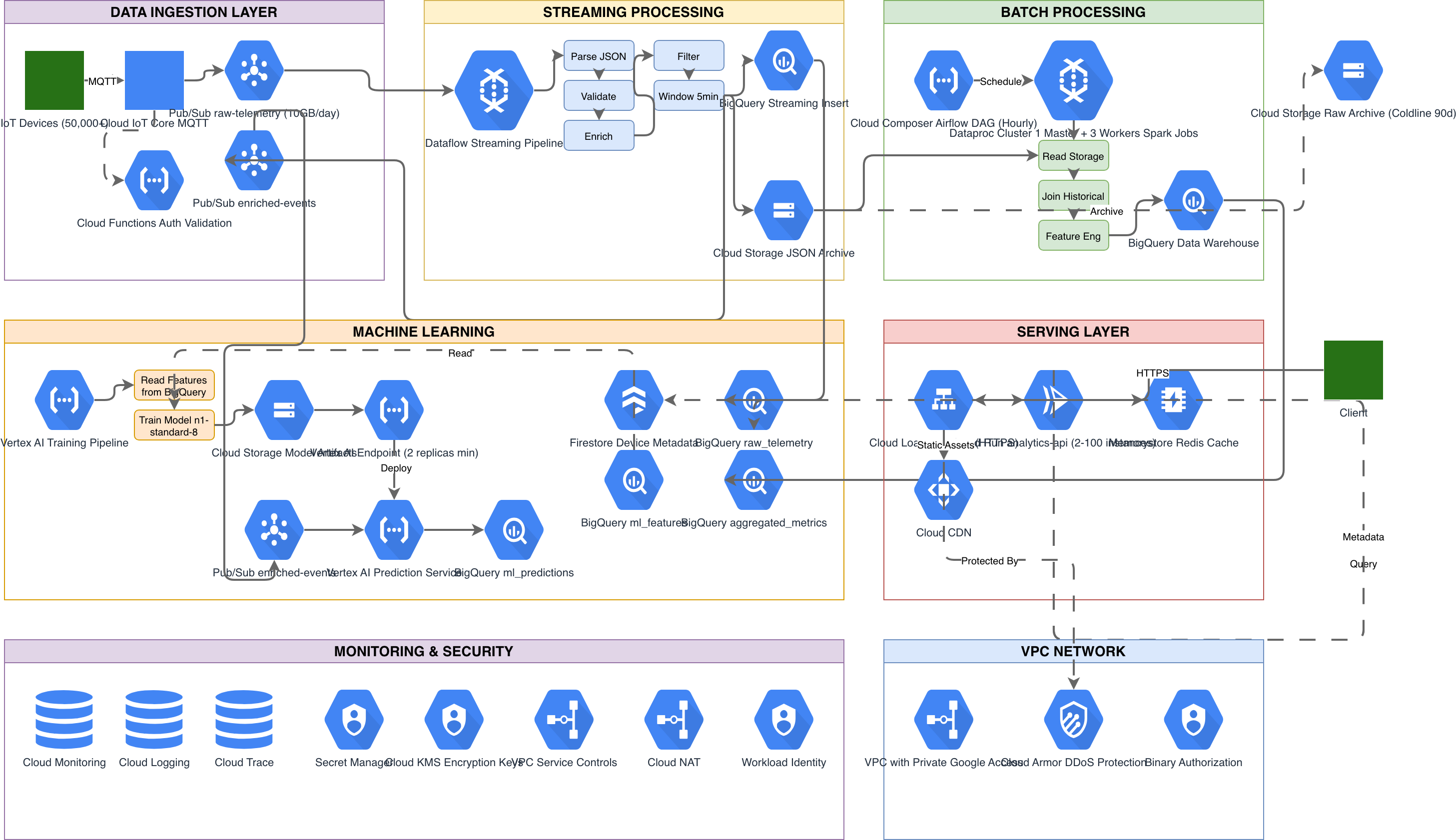
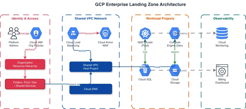
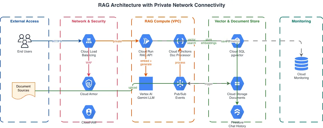
GCP Project Architecture vs AWS Account Architecture vs Azure Subscription Architecture
Each cloud provider uses a different organizational hierarchy. GCP uses Projects inside Folders inside an Organization. AWS uses Accounts inside Organizational Units. Azure uses Subscriptions inside Management Groups. The hierarchy affects how you draw resource boundaries, networking, and IAM, and it changes which container should sit at the outer edge of the diagram. Getting that nesting right up front keeps the rest of the layout honest, because subnets, clusters, and identity bindings all inherit their scope from the boundary they live inside.
| Feature | GCP Project Architecture | AWS Account Architecture | Azure Subscription Architecture |
|---|---|---|---|
| Resource boundary | Projects are the billing and IAM boundary; Shared VPC spans projects via host/service model | Accounts are the hard isolation boundary; VPCs don't span accounts without Transit Gateway or peering | Subscriptions are the billing boundary; VNets peer within or across subscriptions in the same tenant |
| Network sharing | Shared VPC lets a host project own subnets that service projects consume directly | RAM shares subnets cross-account; Transit Gateway connects VPCs at the routing level | VNet peering or Virtual WAN hub connects subscriptions; no native subnet sharing model |
| Identity model | Service accounts scoped per project; Workload Identity for GKE pods; IAM bindings at project/folder/org level | IAM roles per account; cross-account assume-role chains; SSO via Identity Center | Entra ID (Azure AD) tenant-wide; managed identities per resource; RBAC at management group/subscription/resource group |
| Diagram grouping | Outer container for Organization/Folder, inner containers for Projects, nested groups for VPCs and regions | Outer container for Organization, inner containers for Accounts, nested groups for VPCs, AZs, and subnets | Outer container for Management Group, inner containers for Subscriptions, nested groups for Resource Groups and VNets |
| Managed Kubernetes | GKE Autopilot with Workload Identity binding to GCP service accounts; pods access Cloud SQL via private IP | EKS with IRSA mapping pods to IAM roles; pods access RDS via VPC security groups | AKS with Workload Identity Federation to managed identities; pods access Azure SQL via private endpoints |
| Cost tracking | Billing accounts linked to projects; labels for cost allocation; BigQuery billing export | Consolidated billing at Organization level; cost allocation tags; Cost Explorer per account | Cost Management at subscription level; resource tags for allocation; budgets and alerts per scope |
When to use this pattern
Use a GCP architecture diagram when you need to document project structure, Shared VPC topology, or cross-project service dependencies for a Google Cloud deployment. It's the right choice for communicating with platform teams about network segmentation, showing auditors how IAM boundaries map to compliance zones, or onboarding new engineers to a multi-project setup. Reach for it when you are drafting a design doc for a new landing zone and need to show how folders and projects will be laid out before any Terraform runs, when a security review asks for a picture of every public ingress point and the Cloud Armor policies in front of them, or when finance wants a one-page view of which projects roll up to which billing account. It also earns its place in incident retros, where a clear map of Pub/Sub topics, Dataflow pipelines, and BigQuery sinks makes it obvious where a message got stuck or where a permission was missing. Sales engineers and solution architects lean on it during customer proposals to sketch a target GKE-plus-Cloud-Run topology quickly, then hand the editable file to the delivery team. If your architecture spans multiple cloud providers, start with a cloud architecture diagram and drill into GCP-specific detail separately. For Kubernetes-focused views where GKE node pools and pod networking matter more than the GCP project hierarchy, switch to a Kubernetes diagram. Don't use a GCP diagram for application-level service interactions. Use a system architecture or microservices diagram for that.
Frequently asked questions
Does the AI GCP architecture diagram generator use official Google Cloud icons?
Yes. Diagrams.so loads official GCP icons from its 30+ icon libraries when you select GCP as the cloud provider. This AI GCP architecture diagram generator maps each service to its canonical icon: the hexagonal GKE icon, the Cloud SQL database cylinder, the Pub/Sub message icon, and all other standard shapes from Google's architecture icon set.
Can I diagram Shared VPC across multiple GCP projects?
Yes. Mention the host project and service projects in your prompt. The AI draws the host project as an outer container owning the VPC and subnets, with service projects shown as separate containers connected via subnet attachments. Cross-project IAM bindings render as labeled arrows between project boundaries.
How does the AI handle GKE Autopilot vs Standard clusters?
Specify the cluster mode in your prompt. For Autopilot, the AI omits node pool sizing since Google manages it. For Standard, it includes node pool details like machine types and autoscaling ranges. Both modes show Workload Identity bindings, namespace groupings, and pod-to-service connections within the cluster boundary.
What architecture warnings apply to GCP diagrams?
WARN-01 flags single-zone deployments like a Cloud SQL instance without zonal failover. WARN-02 catches public-facing Cloud Run or GKE Ingress endpoints missing Cloud Armor WAF policies. WARN-03 triggers when databases lack read replicas. WARN-04 detects missing VPC boundaries. WARN-05 flags ambiguous component names.
Can I include BigQuery and data pipelines in my GCP diagram?
Yes. Describe your data flow: Pub/Sub to Dataflow to BigQuery, or Cloud Storage to BigQuery external tables. The AI places each component with its GCP icon and draws directional arrows showing data movement. It groups analytics resources together following RULE-06 and labels throughput or batch intervals on the arrows.
Related diagram generators
Generate AWS architecture diagrams from text
Describe your AWS infrastructure in plain English. Get a valid Draw.io diagram with official AWS icons, VPC boundaries, and Multi-AZ placement.
Generate Azure Architecture Diagrams from Text with AI
Describe your Azure infrastructure in plain English. Get a valid Draw.io diagram with official Azure icons, VNet boundaries, resource groups, and NSG rules.
Generate Cloud Architecture Diagrams from Text
Describe your cloud infrastructure in plain English. Get a valid Draw.io diagram with region boundaries, availability zones, managed services, and DR paths.
Generate Kubernetes Diagrams from Text with AI
Describe your Kubernetes cluster in plain English. Get a valid Draw.io diagram with CNCF icons, namespace boundaries, deployments, services, and ingress controllers.