Kubernetes Diagrams: A Complete Visual Guide for DevOps Teams
Kubernetes clusters have enough moving parts that a text description doesn't cut it for onboarding, incident response, or capacity planning. This guide covers what to include in K8s diagrams, with real prompts that generate accurate cluster visualizations.
What to include in a Kubernetes cluster diagram and what to leave out
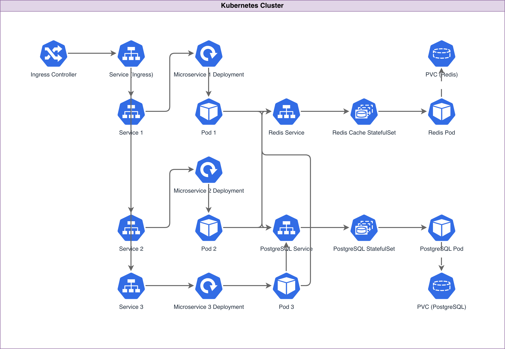
A Kubernetes diagram guide should start with scope. K8s clusters have dozens of resource types, and showing all of them produces an unreadable mess. The right diagram depends on your audience. For platform engineers doing capacity planning, show nodes, node pools, resource requests and limits, and persistent volume claims. For application developers, show Deployments, Services, Ingress rules, and ConfigMaps. For security teams, show NetworkPolicies, RBAC roles, and namespace boundaries. For incident response, show the traffic path from Ingress to Pod with every hop labeled. The minimum viable K8s diagram for most teams includes: cluster boundary, namespaces as grouping containers, Deployments with replica counts, Services with type labels (ClusterIP, NodePort, LoadBalancer), Ingress controller with routing rules, and external dependencies (databases, message queues, cloud storage) outside the cluster boundary. That's six layers of information and it's enough to answer "how does traffic get from the internet to this pod" and "what connects to what." Leave out kube-system components unless you're documenting the platform itself. CoreDNS, kube-proxy, the scheduler, and etcd are important but they clutter application architecture diagrams. Leave out individual Pods unless you're documenting a specific incident where pod placement mattered. Show Deployments with replica counts instead. Leave out all labels and annotations unless a specific label drives behavior (like Istio sidecar injection or node affinity). Diagrams.so generates K8s diagrams with CNCF icons from the official Kubernetes icon set. Pods get the hexagonal pod icon. Deployments get the deployment icon with a replica count badge. Services get the service icon with the type label. These icons are standardized across the CNCF ecosystem, so your diagrams are instantly recognizable to anyone who works with Kubernetes.
Diagramming namespaces and workloads with proper boundaries
Namespaces are the primary organizational unit in Kubernetes and they should be the primary grouping boundary in your diagrams. Each namespace gets its own container rectangle with a labeled header. Resources inside the namespace are visually contained within that rectangle. Example prompt: "Kubernetes cluster on EKS with four namespaces. Namespace 'frontend': Next.js Deployment with 3 replicas, ClusterIP Service on port 3000. Namespace 'api': FastAPI Deployment with 5 replicas, ClusterIP Service on port 8000, HorizontalPodAutoscaler targeting 70% CPU with min 5 max 20 replicas. Namespace 'workers': Celery worker Deployment with 4 replicas consuming from RabbitMQ, CronJob 'daily-report' running at 02:00 UTC. Namespace 'monitoring': Prometheus StatefulSet with 2 replicas, Grafana Deployment with 1 replica, Alertmanager Deployment with 2 replicas. NGINX Ingress Controller in ingress-nginx namespace routing /app to frontend service and /api to api service. External RDS PostgreSQL and ElastiCache Redis outside cluster boundary." This generates a diagram with the EKS cluster as the outermost boundary. Inside it, four namespace rectangles contain their respective workloads. The Ingress Controller sits in its own namespace with routing arrows going to the frontend and api Services. Each Deployment shows its replica count. The HPA appears as a connected component to the api Deployment with the scaling parameters labeled. External dependencies (RDS, ElastiCache) sit outside the cluster boundary with arrows crossing the boundary. The CronJob in the workers namespace gets a distinct icon from regular Deployments. The StatefulSet for Prometheus gets the StatefulSet icon, which is visually different from the Deployment icon and communicates that this workload has stable network identities and persistent storage. For multi-cluster diagrams, each cluster gets its own boundary rectangle. Cross-cluster communication shows as labeled arrows between clusters. If you're using something like Skupper or Submariner for multi-cluster networking, mention it in the prompt and the connection gets labeled with the mesh technology.
Networking: map the path from Ingress to Service to Pod
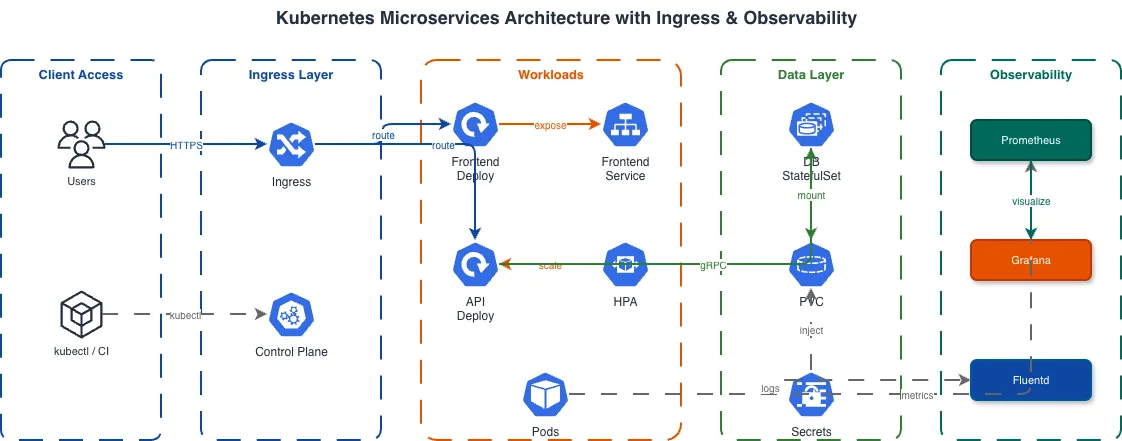
The most useful K8s diagram for debugging is the networking path diagram. It traces traffic from external client to pod with every component in the chain labeled. Example prompt: "Kubernetes networking diagram. External client sends HTTPS request to AWS NLB (Network Load Balancer). NLB forwards TCP 443 to NGINX Ingress Controller DaemonSet on NodePort 30443. Ingress Controller terminates TLS with cert-manager Let's Encrypt certificate. Ingress rules route /api/* to api-service ClusterIP on port 8000 and /app/* to frontend-service ClusterIP on port 3000. api-service has 5 endpoint pods. kube-proxy maintains iptables rules for round-robin load balancing across the 5 pods. Show DNS resolution path: external DNS resolves to NLB, CoreDNS resolves service names to ClusterIP addresses inside the cluster." This generates a horizontal flow diagram. The external client is on the far left. An arrow labeled HTTPS/443 goes to the NLB. The NLB arrow goes to the Ingress Controller with TCP/30443 labeled. From the Ingress Controller, two arrows branch: one to api-service labeled /api/* and one to frontend-service labeled /app/*. From each Service, arrows fan out to the endpoint pods. A separate DNS resolution path shows at the bottom with CoreDNS resolving internal service names. This level of detail matters because K8s networking has multiple layers that are invisible until something breaks. The NLB to NodePort connection, the Ingress Controller's TLS termination, the Service to Pod iptables rules, the DNS resolution chain -- each of these is a potential failure point. A diagram that shows all of them lets an on-call engineer trace exactly where traffic is failing during an incident. For service-to-service communication, show the full chain: source Pod > source Service > destination Service > destination Pod. If you're using NetworkPolicies, add labels to the connections showing which policies allow or deny the traffic. A connection labeled "allowed by allow-api-to-db NetworkPolicy on port 5432" tells the reader that this communication path is explicitly permitted and which policy controls it.
Storage and stateful workloads: StatefulSets, PVCs, and StorageClasses
Stateful workloads in Kubernetes need their own diagram section because the storage model is fundamentally different from the networking model. A Deployment can be scaled up and down freely because pods are interchangeable. A StatefulSet can't, because each pod has a stable identity, a stable hostname, and a dedicated PersistentVolumeClaim. The diagram should show StatefulSets with their ordinal pod names (postgres-0, postgres-1, postgres-2), each connected to its own PVC. Each PVC references a StorageClass, and the StorageClass references the underlying storage provider (EBS gp3, EFS, or a CSI driver). This three-layer relationship (Pod > PVC > StorageClass > Provider) needs to be visible in the diagram because it's the chain that determines IOPS, throughput, and availability. For databases running in Kubernetes (which is increasingly common with operators like CloudNativePG, Percona Operator, or Strimzi for Kafka), show the operator as a separate component that manages the StatefulSet. The operator reconciliation loop is the thing that handles failover, backup, and scaling. Without it visible in the diagram, reviewers might assume the StatefulSet is self-managing, which it isn't. Backup flows belong in storage diagrams. Show the VolumeSnapshot path: CronJob triggers VolumeSnapshot creation, the CSI driver snapshots the underlying EBS volume, the snapshot is stored in S3 via the snapshot controller. This path is invisible during normal operations but critical during disaster recovery. Making it visible in the architecture diagram ensures the backup strategy is part of the architecture review, not an afterthought. For shared storage, show which pods mount the same PVC with ReadWriteMany access mode. EFS-backed PVCs can be shared across pods and even across nodes. EBS-backed PVCs are ReadWriteOnce and tied to a single node. Your diagram should make this constraint visible because it affects pod scheduling and scaling.
GitOps and deployment pipeline visualization from commit to cluster
GitOps pipelines have enough moving parts that a diagram is the only sane way to onboard new team members. The pipeline touches at least five systems: source control, CI, container registry, GitOps controller, and the target cluster. Example prompt: "GitOps deployment pipeline for Kubernetes. Developer pushes commit to GitHub main branch. GitHub Actions workflow triggers: runs unit tests, builds Docker image, pushes image to Amazon ECR with git SHA tag. GitHub Actions updates the image tag in the Kubernetes manifests repository (kustomize overlay) and commits the change. ArgoCD watches the manifests repository. ArgoCD detects the new commit, diffs the desired state against the live cluster state, and syncs the changes. ArgoCD applies the updated Deployment manifest to the EKS cluster, which triggers a rolling update. ArgoCD health checks verify pod readiness. Slack notification on success or failure. Show rollback path: ArgoCD reverts to previous Git commit on failed health check." This generates a left-to-right flow starting with the developer's Git push. GitHub Actions appears as a CI/CD block with test, build, and push stages. An arrow goes to ECR showing the image push. A separate arrow goes to the manifests repository showing the kustomize update. ArgoCD sits between the manifests repo and the EKS cluster with a sync arrow. The cluster shows the rolling update with old and new pods. The rollback path shows as a return arrow from the cluster back through ArgoCD to the previous Git commit. The key detail most pipeline diagrams miss is the separation between the application repository and the manifests repository. In GitOps, these are typically separate repos. The CI pipeline writes to the manifests repo, and the GitOps controller reads from it. This separation is what makes GitOps auditable: every cluster change has a corresponding Git commit. Your diagram should show both repos as distinct components with the CI pipeline bridging them. Include the promotion flow if you deploy to multiple environments. Dev, staging, and production clusters each watch different branches or directories in the manifests repo. ArgoCD ApplicationSets can target multiple clusters from a single configuration. Show each cluster with its ArgoCD sync pointing to the correct branch.
Service mesh architecture: Istio and Linkerd sidecar patterns
Service mesh diagrams need to show two planes: the data plane (sidecar proxies handling traffic) and the control plane (the mesh management components). Collapsing them into a single view hides the operational complexity that justifies running a mesh in the first place. For Istio, the control plane consists of istiod (which combines Pilot, Citadel, and Galley). The data plane consists of Envoy sidecar proxies injected into every application pod. Your diagram should show istiod in the istio-system namespace with arrows going to every sidecar, representing configuration distribution. Each application pod should show the application container and the Envoy sidecar as two containers within the same pod boundary. The traffic flow through a mesh is: source Pod's Envoy sidecar intercepts outbound traffic via iptables rules, applies routing rules (VirtualService), applies traffic policies (DestinationRule), establishes mTLS with the destination Pod's Envoy sidecar, and forwards the request to the destination container. That's five hops for a single service-to-service call. Your diagram should show at least the mTLS connection between sidecars and the routing rules applied. For Linkerd, the pattern is similar but the proxy is linkerd2-proxy instead of Envoy, and the control plane components are linkerd-destination, linkerd-identity, and linkerd-proxy-injector. Linkerd's control plane is lighter than Istio's, which matters for resource-constrained clusters. The observability integration deserves its own section in the mesh diagram. Sidecars export metrics (request rate, error rate, latency) to Prometheus without application code changes. Show the metrics flow: sidecar > Prometheus > Grafana dashboard. Include Jaeger or Tempo for distributed tracing: sidecar exports trace spans > collector > Jaeger UI. This observability data is the primary reason teams adopt service meshes, so making it visible in the architecture diagram justifies the operational overhead. Diagrams.so generates mesh diagrams with distinct visual treatment for sidecars versus application containers. The sidecar icons are smaller and attached to the pod boundary, making it clear they're infrastructure components, not application code.
Seven common Kubernetes diagram mistakes and how to fix them
Mistake 1: Showing Pods instead of Deployments. Pods are ephemeral. They crash, get rescheduled, scale up and down. A diagram showing Pod-1, Pod-2, Pod-3 is outdated the moment a pod restarts. Show the Deployment with replica count instead. "user-service Deployment (3 replicas)" is stable and accurate. Individual pod names are not. Mistake 2: Omitting namespace boundaries. Without namespaces, the diagram implies everything runs in the default namespace, which is almost never true in production. Namespaces provide RBAC boundaries, resource quota boundaries, and NetworkPolicy scope. If your diagram doesn't show them, reviewers can't assess access control. Mistake 3: Drawing direct pod-to-pod connections. In Kubernetes, pods communicate through Services. A direct arrow from pod-A to pod-B implies hardcoded IP addresses, which break on every pod restart. Always route connections through a Service icon. The Service provides DNS-based discovery and load balancing, and your diagram should show that. Mistake 4: Forgetting the Ingress to Service connection. Many diagrams show an Ingress resource and application pods but skip the Service in between. The Ingress routes to a Service. The Service routes to Pods. This two-hop path determines how traffic distribution works and it needs to be visible. Mistake 5: Not showing what's outside the cluster. Every Kubernetes application depends on external services: managed databases, cloud storage, SaaS APIs, DNS providers. Drawing the cluster boundary and placing external dependencies outside it shows the blast radius of a cluster failure. If everything is inside the cluster boundary, a cluster failure is total. If the database is outside, data survives a cluster rebuild. Mistake 6: Using generic icons for Kubernetes resources. Kubernetes has a standardized icon set maintained by the CNCF. Pods are hexagons. Deployments have a distinct shape. Services have their own icon. Using these standard shapes means anyone familiar with K8s can read your diagram without a legend. Diagrams.so uses the CNCF icon set automatically when generating Kubernetes diagrams. Mistake 7: Conflating logical architecture with physical topology. A diagram showing "user-service talks to order-service" is logical architecture. A diagram showing "pods on node-pool-1 in zone-a communicate with pods on node-pool-2 in zone-b via overlay network" is physical topology. These are different diagrams for different audiences. Mixing them creates confusion. Generate them separately.
Related diagrams from the gallery

Try these diagram generators
Generate Kubernetes Diagrams from Text with AI
Describe your Kubernetes cluster in plain English. Get a valid Draw.io diagram with CNCF icons, namespace boundaries, deployments, services, and ingress controllers.
Generate DevOps Diagrams from Text with AI
Describe your DevOps toolchain in plain English. Get a valid Draw.io diagram with correct tool icons, pipeline flows, and infrastructure relationships.
Generate Microservices Architecture Diagrams from Text
Describe your service boundaries in plain English. Get a valid Draw.io diagram with API gateways, message brokers, database-per-service patterns, and service mesh routing.