What Is an Architecture Diagram?
Architecture diagrams map the components of a system and how they connect. They are the primary communication tool between engineers, stakeholders, and future maintainers.
Definition: what an architecture diagram actually represents
An architecture diagram is a visual representation of a system's components, their relationships, and the principles governing its design and evolution. Unlike code, which describes behavior, an architecture diagram describes structure. It answers questions like: what services exist, how they communicate, where data lives, and what boundaries separate trust zones. Understanding what is an architecture diagram starts with recognizing that it's not a screenshot of your infrastructure. It's an abstraction. A good architecture diagram omits irrelevant detail while preserving every decision that matters. Simon Brown's C4 model formalized this idea into four zoom levels: system context (how your system fits into the world), container (the deployable units), component (the internal modules), and code (class-level detail). Most teams only need the first two. The system context diagram shows your application as a single box surrounded by the users and external systems it interacts with. The container diagram breaks that box open to reveal services, databases, message brokers, and file stores. Each level answers questions for a different audience. Executives want the system context. Platform engineers want the container view. New hires want both. The worst architecture diagrams are the ones drawn once during a design review and never updated. They become misleading within weeks. The best ones live alongside the code, checked into version control, and updated as part of the pull request process.
Six types of architecture diagrams and when to use each
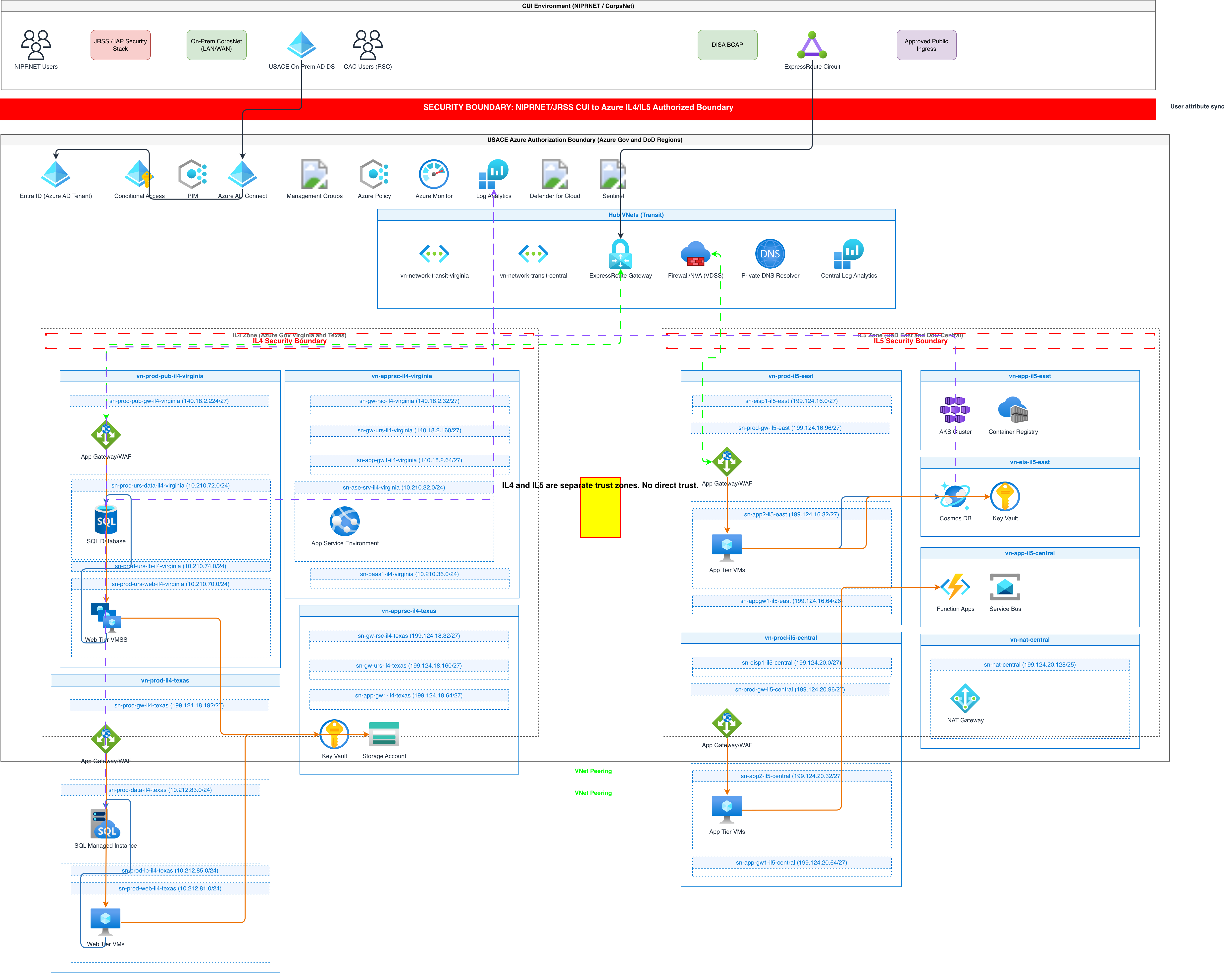
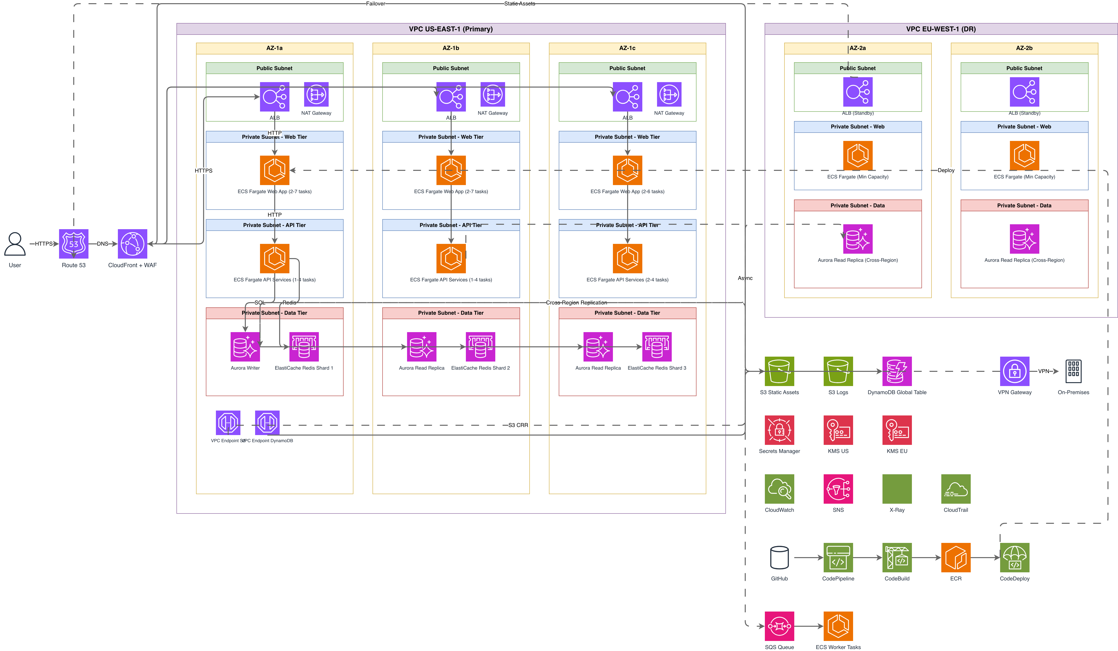
System architecture diagrams show every major component and how data flows between them. Use these for onboarding docs and technical design documents. A typical system architecture diagram for an e-commerce platform might show the Next.js frontend, an API gateway, three microservices (catalog, orders, payments), a PostgreSQL primary with read replica, a Redis cache, and an S3 bucket for media. Cloud architecture diagrams add provider-specific services and their configurations. Instead of a generic 'message queue' box, you draw an Amazon SQS queue with a dead-letter queue configured for 3 retries and a 14-day retention period. Cloud diagrams use official icon sets from AWS, Azure, or GCP to make services instantly recognizable. Software architecture diagrams focus on code-level structure: modules, classes, interfaces, and dependency injection boundaries. These matter most in monolithic applications where the runtime deployment is a single artifact but the internal structure is complex. Network architecture diagrams map IP address spaces, subnets, routing tables, firewalls, load balancers, and DNS resolution paths. Network engineers at companies like Cloudflare document their anycast architecture with these. Include CIDR blocks, port numbers, and protocol labels on every connection. Security architecture diagrams overlay trust boundaries, encryption points, and authentication flows onto a system diagram. Draw a dashed red boundary around your VPC, mark TLS termination at the load balancer, show mTLS between internal services, and label which IAM roles each service assumes. Data architecture diagrams trace data lineage from ingestion through transformation to consumption. Spotify's data platform documentation shows events flowing from client apps through Kafka topics into their data lake on GCS, processed by Scio jobs, and served via BigQuery.
Why architecture diagrams matter for engineering teams
Architecture diagrams reduce the cost of onboarding. A new engineer at Stripe reportedly spends their first week reading architecture docs before touching code. Without diagrams, that same information transfer happens through tribal knowledge in Slack threads that no one can find six months later. They also reduce the cost of mistakes. When a team at Amazon proposes a new feature, they write a six-page design document that includes architecture diagrams showing the current state and the proposed state. Reviewers can spot issues like single points of failure, missing encryption, or circular dependencies before any code is written. A senior architect reviewing a diagram might notice that a proposed service calls another service synchronously, creating a tight coupling that will cascade failures. That's a five-minute catch on a diagram versus a two-week incident in production. Architecture diagrams create a shared vocabulary. When everyone can see that the 'auth service' is a distinct container with its own database, discussions about authentication become precise. Without the diagram, one person might think auth is a library embedded in each service while another assumes it's a centralized gateway. Diagrams also serve as the foundation for capacity planning. If you can see that all traffic funnels through a single API gateway before reaching five backend services, you know exactly where to measure throughput and where bottlenecks will appear. Infrastructure teams at Netflix use architecture diagrams to plan regional failover, identifying every stateful component that needs replication.
Best practices for creating architecture diagrams that last
Use a consistent icon set. Mixing AWS icons from 2019 with Azure icons from 2024 and hand-drawn circles for databases creates cognitive overhead. Pick one icon library and stick with it. For multi-cloud environments, use provider-official icons for each cloud but keep the visual weight consistent by sizing all icons to the same bounding box. Label every connection. An arrow between two boxes without a label is almost useless. Does it carry HTTP requests? gRPC calls? Kafka messages? PostgreSQL wire protocol? Label the protocol and, if relevant, the port. A label like 'HTTPS :443 / REST' is worth more than an unlabeled line connecting 'Frontend' to 'API.' Include a legend. Even if your icon set is standard, add a legend that explains your visual conventions. Dashed lines for async communication, solid lines for synchronous calls, red borders for public-facing components, and gray backgrounds for VPC boundaries. Show failure modes. The best architecture diagrams indicate what happens when a component fails. Add a note explaining that the circuit breaker on the payment service opens after 5 consecutive failures and routes traffic to a fallback queue. This turns the diagram from a success-path illustration into an operations reference. Version your diagrams. Store them in the same repository as the code they describe. When a pull request changes the architecture, require an updated diagram as part of the review. Draw.io's XML format diffs cleanly in Git, unlike binary image files. Keep diagrams at one zoom level each. Resist the urge to put everything on one diagram. A C4 system context diagram and a separate container diagram are far more useful than a single diagram trying to show both external users and internal class structures.
Common mistakes architects make with diagrams
The most common mistake is the everything diagram. One diagram shows users, load balancers, services, databases, caches, queues, monitoring, CI/CD pipelines, and DNS configuration all in a single view. This produces a visual mess that communicates nothing. Split concerns into separate diagrams, each at a consistent abstraction level. The second mistake is using vague labels. A box labeled 'Backend' connected to another box labeled 'Database' tells the reader almost nothing. Is the backend a single service or twenty? Is the database PostgreSQL, DynamoDB, or a hand-rolled file store? Specificity is the point. Label the box 'Order Service (Go, gRPC)' and the database 'orders_db (PostgreSQL 15, RDS Multi-AZ).' The third mistake is drawing aspirational architecture instead of actual architecture. If your disaster recovery region hasn't been tested in 18 months and the replication lag is unmeasured, don't draw a clean multi-region active-active diagram. Draw what exists, then create a separate target-state diagram with a clear label saying 'Proposed.' Mixing current and future state on one diagram is how teams lose track of reality. The fourth mistake is orphaned diagrams. A diagram created in Lucidchart during a design review, shared as a PNG in Confluence, and never updated again. Within three months, two services have been renamed, one has been split, and a new database has been added. The diagram now actively misleads anyone who references it. Use a format like .drawio that lives in version control alongside the code, so updates happen naturally during code reviews. The fifth mistake is ignoring data flow direction. Arrows should indicate which component initiates communication. A frontend makes requests to an API. The API queries a database. A worker polls a queue. Get the direction right or the diagram implies the wrong dependency structure.
Creating architecture diagrams with AI tools
AI diagram generators change the workflow for creating architecture diagrams. Instead of dragging boxes onto a canvas and manually routing arrows, you describe the system in natural language and get a structured diagram back. The key advantage is speed. Describing a three-tier web application with a React frontend, Node.js API, PostgreSQL database, Redis cache, and S3 file storage takes about 30 seconds of typing. The AI places each component, draws the connections, applies the correct cloud provider icons, and aligns everything to a grid. That same diagram takes 10 to 15 minutes to build manually in a drag-and-drop tool. AI generation also enforces consistency. Every diagram uses the same layout rules, the same icon sizes, the same spacing. Human-created diagrams drift in style across teams. One team uses large icons with small text, another uses no icons at all, and a third mixes vendor icons with custom shapes. Diagrams.so generates architecture diagrams from text descriptions and outputs native Draw.io XML files. You describe your system, select the cloud provider for the correct icon set, and get a .drawio file that opens in Draw.io desktop, VS Code, Confluence, or any mxGraph-compatible editor. The output includes architecture warnings for common issues like single-AZ deployments or public databases without WAF protection. AI generation doesn't replace architectural thinking. You still need to decide what abstraction level to diagram, which components matter, and what the audience needs to understand. The AI handles the visual layout and format. The architect handles the content decisions.
Real-world examples

Generate these diagrams with AI
Generate System Architecture Diagrams from Text
Describe your system's components in plain English. Get a valid Draw.io diagram with services, databases, message queues, caches, and API connections.
Generate Cloud Architecture Diagrams from Text
Describe your cloud infrastructure in plain English. Get a valid Draw.io diagram with region boundaries, availability zones, managed services, and DR paths.
Generate AWS architecture diagrams from text
Describe your AWS infrastructure in plain English. Get a valid Draw.io diagram with official AWS icons, VPC boundaries, and Multi-AZ placement.