How to Create AWS Architecture Diagrams: Best Practices for 2026
Most AWS diagrams fail design reviews because they skip VPC boundaries, ignore availability zones, or use generic icons that don't map to actual services. These best practices fix that with real prompts and specific examples.
Use the official AWS icon set and why it matters for design reviews
AWS architecture diagram best practices start with icons. AWS publishes an official architecture icon set updated annually. The 2025 set contains 900+ icons covering every service from EC2 to Bedrock. When your diagram uses the official icons, reviewers can identify services instantly. When it uses generic boxes with text labels, reviewers spend cognitive effort translating "Application Server" to "ECS Fargate task" or "Database" to "Aurora PostgreSQL." That translation step introduces ambiguity that derails design reviews. Diagrams.so loads the official AWS icon set automatically when you select AWS as the cloud provider. Every service you mention in your prompt gets the correct icon from the AWS Architecture Icons library. An ALB gets the Elastic Load Balancing icon with the "Application" badge. An S3 bucket gets the S3 icon, not a generic cylinder. A Lambda function gets the Lambda icon, not a generic rectangle with "Lambda" written inside. The icon set also includes grouping shapes that represent AWS constructs: VPC boundaries, availability zone containers, subnet rectangles, security group dashed lines, and region headers. These grouping shapes are not decorative. They communicate network topology. A Fargate task inside a private subnet rectangle inside an AZ container inside a VPC boundary tells the reviewer exactly where that task runs and what network path traffic takes to reach it. A Fargate task floating outside any boundary tells the reviewer nothing about network isolation. When you're generating diagrams, name the specific AWS service in your prompt. Don't write "load balancer." Write "Application Load Balancer" or "Network Load Balancer" because they have different icons and different architectural implications. The ALB operates at layer 7 and supports path-based routing. The NLB operates at layer 4 and supports static IP addresses. Your diagram should communicate which one you chose and why.
Show VPC boundaries and availability zones with correct nesting
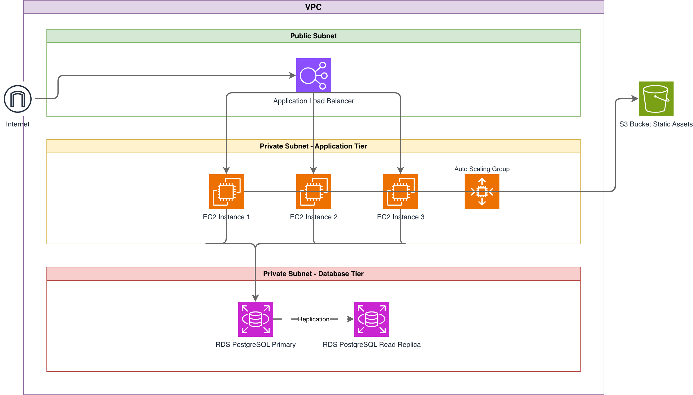
Every AWS architecture diagram should show VPC boundaries and availability zones unless the architecture is entirely serverless and region-scoped. Here's a prompt that demonstrates correct nesting. Example prompt: "AWS VPC in us-east-1 with CIDR 10.0.0.0/16. Two availability zones: us-east-1a and us-east-1b. Each AZ has one public subnet (10.0.1.0/24 and 10.0.2.0/24) and one private subnet (10.0.3.0/24 and 10.0.4.0/24). Internet Gateway attached to VPC. NAT Gateway in each public subnet. Application Load Balancer spanning both public subnets. Three ECS Fargate tasks in the private subnets behind the ALB. Aurora PostgreSQL cluster with writer in us-east-1a private subnet and read replica in us-east-1b private subnet. S3 VPC endpoint for private access to S3 bucket." This prompt generates a diagram with six layers of nesting: Region > VPC > AZ > Subnet type > Subnet > Resources. The ALB spans both AZs at the public subnet level. The Fargate tasks distribute across both private subnets. Aurora shows cross-AZ replication with an arrow between the writer and replica. The S3 VPC endpoint appears on the VPC boundary itself because it's a VPC-level construct, not a subnet-level one. Common mistake: putting the NAT Gateway in a private subnet. NAT Gateways must be in public subnets to route outbound internet traffic from private subnets. The AI places them correctly if your prompt specifies "NAT Gateway in each public subnet." If you just write "NAT Gateway" without location, the placement may be wrong. Another common mistake: showing the ALB inside one AZ. ALBs are regional resources that span subnets across AZs. Your diagram should show the ALB at the VPC level or spanning both AZ groups, not nested inside a single AZ container. This visual distinction communicates that the ALB survives an AZ failure, which is the whole point of multi-AZ deployment.
Common anti-patterns: single-AZ, public RDS, and missing WAF
Three anti-patterns appear in most AWS diagrams, and Diagrams.so's architecture warnings catch all three. Anti-pattern 1: Single-AZ deployment. A diagram showing all resources in one availability zone tells the reviewer this architecture has a single point of failure at the infrastructure level. Even if you're deploying to production, if your diagram shows one AZ, people assume that's the plan. WARN-01 fires when it detects this. The fix is straightforward. Add a second AZ to your prompt with matching resources: "ECS Fargate tasks distributed across private subnets in us-east-1a and us-east-1b." The generated diagram shows two AZ groups with tasks in each, making the high-availability design explicit. Anti-pattern 2: RDS instances in public subnets or without subnet group boundaries. Databases should never be directly reachable from the internet. Your diagram should show RDS inside a private subnet with no inbound route from the Internet Gateway. If your prompt says "RDS PostgreSQL instance" without specifying subnet placement, the AI may not generate the correct boundary. Be explicit: "RDS PostgreSQL Multi-AZ instance in a private DB subnet group with no public accessibility." WARN-04 catches databases floating outside security boundaries. Anti-pattern 3: Internet-facing ALB without WAF or CloudFront. If your diagram shows traffic flowing from the internet directly to an ALB, WARN-02 flags the missing WAF layer. For production workloads, the standard pattern is: Internet > CloudFront > WAF > ALB > Compute. Adding "AWS WAF attached to CloudFront distribution in front of the ALB" to your prompt generates the correct security chain. Here's a prompt that avoids all three: "Production AWS architecture. CloudFront distribution with AWS WAF. Application Load Balancer in public subnets across us-east-1a and us-east-1b. Four ECS Fargate tasks split across private subnets in both AZs. RDS PostgreSQL Multi-AZ deployment in private DB subnet group. ElastiCache Redis cluster in private subnet for session caching. S3 bucket for static assets served through CloudFront. CloudWatch alarms on ALB 5xx rate and RDS CPU utilization." This prompt produces a diagram that passes all five architecture warnings. Multi-AZ eliminates WARN-01. WAF eliminates WARN-02. Multi-AZ RDS eliminates WARN-03. VPC boundaries eliminate WARN-04. Named services eliminate WARN-05.
Diagram multi-region and disaster recovery architectures
Multi-region diagrams are where most manual tools break down because the visual complexity doubles or triples. AI generation handles this by repeating the infrastructure pattern across region boundaries. Example prompt: "Active-passive multi-region AWS architecture. Primary region us-east-1: CloudFront distribution, ALB in public subnets across two AZs, four ECS Fargate tasks in private subnets, Aurora PostgreSQL cluster with one writer and two read replicas. Secondary region us-west-2: identical ALB, ECS, and Aurora setup but Aurora configured as a global database secondary cluster with read-only replicas. Route 53 with failover routing policy pointing to CloudFront in primary and ALB in secondary. Aurora global database replication arrow from us-east-1 writer to us-west-2 secondary. S3 buckets in both regions with cross-region replication enabled." This generates a diagram with two region boundaries side by side. The primary region shows the full stack with CloudFront at the entry point. The secondary region shows the same compute and database stack but with Aurora marked as "secondary (read-only)." Route 53 appears above both regions with failover arrows. The Aurora cross-region replication is shown as a labeled arrow between the two database clusters. For disaster recovery diagrams, you need to communicate RTO and RPO visually. Add annotations to your prompt: "Label the Aurora global database replication arrow with 'RPO < 1 second' and label the Route 53 failover with 'RTO < 60 seconds'." These labels appear on the connection arrows in the generated diagram, giving reviewers the recovery metrics at a glance. Pilot light and warm standby DR strategies need different diagrams. For pilot light, the secondary region shows only the database and minimal infrastructure with a note: "Scale-up triggered by Route 53 health check failure." For warm standby, the secondary region shows a reduced-capacity version of the primary. Make these distinctions explicit in your prompt because the AI can't infer your DR strategy from vague input like "with disaster recovery."
Visualize security layers: subnets, security groups, and NACLs
Security visualization in AWS diagrams requires showing three layers: subnets (network isolation), security groups (stateful instance-level firewall), and NACLs (stateless subnet-level firewall). Most diagrams only show subnets and skip the other two. That's a gap that security reviewers will flag. Security groups should appear as dashed-line boundaries around the resources they protect. A typical three-tier architecture has at least three security groups: one for the ALB (allowing inbound 443 from 0.0.0.0/0), one for the application tier (allowing inbound from the ALB security group only), and one for the database tier (allowing inbound 5432 from the application security group only). When you specify these in your prompt, the diagram shows the chain of trust visually. Example prompt: "AWS three-tier security architecture. VPC with public and private subnets in two AZs. ALB security group allowing inbound HTTPS (443) from any source. ECS Fargate security group allowing inbound traffic only from ALB security group on port 8080. Aurora security group allowing inbound PostgreSQL (5432) only from ECS security group. NACLs on public subnets allowing inbound 443 and outbound ephemeral ports. NACLs on private subnets allowing inbound from VPC CIDR only. Show security group boundaries as dashed lines around each tier." The generated diagram shows three concentric security zones. The outermost is the VPC boundary. Inside that, public and private subnets provide network isolation. Within the subnets, dashed-line security group boundaries wrap each tier. Connection arrows between tiers are labeled with the allowed ports and protocols. This layered view lets a security reviewer trace the path from internet to database and verify that every hop is restricted. For compliance-sensitive environments, add IAM role annotations to your prompt. "ECS task role with read-only access to S3 bucket and write access to SQS queue. Lambda execution role with DynamoDB read/write and CloudWatch Logs." These don't generate visual boundaries but appear as labels on the components, making the least-privilege configuration visible in the diagram. Don't forget egress rules. Most diagrams show inbound traffic paths but ignore outbound. If your application needs to call external APIs, show the NAT Gateway egress path with a label indicating which external services are allowed. This prevents the "how does this service reach the payment API" question during reviews.
Generate AWS diagrams from existing infrastructure descriptions
The fastest way to generate an accurate AWS diagram is to describe your existing infrastructure, not your idealized architecture. Pull information from three sources: your Terraform state, your CloudFormation stacks, or your AWS console. From Terraform, run 'terraform state list' to get every resource, then 'terraform state show' on the key networking and compute resources. Translate the output into a prompt. A Terraform state file showing aws_ecs_service with desired_count=3, aws_lb with type="application", and aws_rds_cluster with engine="aurora-postgresql" becomes: "Three ECS Fargate tasks behind an Application Load Balancer connected to Aurora PostgreSQL cluster." From CloudFormation, the template's Resources section gives you the component list directly. Each resource's Type field (AWS::ECS::Service, AWS::ElasticLoadBalancingV2::LoadBalancer) maps to a component in your prompt. Properties like SubnetIds and SecurityGroupIds tell you the network placement. From the AWS console, the VPC dashboard's resource map shows your current topology. Translate what you see into a prompt. The key information is: which services are running, which subnets they're in, which security groups they belong to, and how they connect to each other. Once you have the prompt describing your actual infrastructure, paste it into Diagrams.so. The architecture warnings become a gap analysis tool. If your production deployment is single-AZ, WARN-01 fires and you've just documented a real risk, not a theoretical one. If your RDS instance lacks replicas, WARN-03 fires and that goes into the next sprint's backlog. This workflow works particularly well for teams that inherited infrastructure without documentation. Generate the diagram, verify it against the running infrastructure, save the .drawio file in your team's documentation repo, and now you have a visual record that you can keep updated by regenerating from updated infrastructure descriptions. The .drawio export means the diagram lives in version control right next to the code that deploys it.
Related diagrams from the gallery


Try these diagram generators
Generate AWS architecture diagrams from text
Describe your AWS infrastructure in plain English. Get a valid Draw.io diagram with official AWS icons, VPC boundaries, and Multi-AZ placement.
Generate Cloud Architecture Diagrams from Text
Describe your cloud infrastructure in plain English. Get a valid Draw.io diagram with region boundaries, availability zones, managed services, and DR paths.
Generate Security Architecture Diagrams from Text with AI
Describe your trust boundaries, encryption layers, and access controls in plain English. Get a valid Draw.io security diagram with defense-in-depth zones.
Frequently asked questions
What are the most important AWS architecture diagram best practices?
Show clear VPC and subnet boundaries, label availability zones, use the official AWS icon set, group resources by tier or service, and make traffic flow and security boundaries (security groups, NACLs, WAF) visible. Keep each diagram focused on one view rather than cramming every detail onto a single canvas.
How do I show Multi-AZ in an AWS architecture diagram?
Draw each availability zone as a labeled boundary inside the VPC (for example us-east-1a and us-east-1b) and place a copy of the redundant resource — an EC2 instance, NAT gateway, or RDS standby — in each zone. Connect them to the shared load balancer or primary so the failover relationship is explicit.
What icons should I use in AWS architecture diagrams?
Use the official AWS Architecture Icons. Consistent, up-to-date icons make a diagram instantly readable and signal that the design follows AWS conventions. Diagrams.so applies the official AWS icon set automatically when it generates a diagram.
How do I generate an AWS architecture diagram from text?
Describe your infrastructure in plain English — for example, "ALB in front of EC2 Auto Scaling across two AZs, RDS PostgreSQL Multi-AZ, and S3 for static assets" — and Diagrams.so produces an editable .drawio diagram with official AWS icons, VPC boundaries, and correct AZ placement in seconds.
What is the difference between a good and bad AWS architecture diagram?
A good diagram has clear boundaries, consistent official icons, labeled AZs and CIDR ranges, visible security layers, and a single clear purpose. A bad one mixes notation, hides network and security boundaries, omits redundancy, and tries to show everything at once — making it hard to review or hand off.