The Complete Guide to AI-Generated Architecture Diagrams
AI diagram generators don't read your mind. They parse structured prompts and map components to Draw.io XML with correct icons, connections, and layout. This guide shows you how to write prompts that produce diagrams worth putting in a design review.
What AI diagram generators actually do under the hood
An AI architecture diagram guide starts with understanding what the tool actually does, not what marketing says it does. AI diagram generators are language models trained to output structured XML. When you type a prompt like "three-tier web app on AWS with CloudFront, ALB, ECS Fargate, and Aurora PostgreSQL," the model parses your text into a component list, determines relationships between those components, selects icons from a shape library, and outputs an mxGraphModel XML document. That XML contains exact coordinates, connection points, and style attributes for every element. There is no visual reasoning happening. The model does not see a diagram and adjust it. It generates XML tokens sequentially, the same way it would generate a paragraph of text. This is why prompt specificity matters so much. Vague input like "make me a cloud diagram" produces vague output with generic boxes and unlabeled arrows. Specific input like "VPC with two public subnets in us-east-1a and us-east-1b, each containing a NAT Gateway, and two private subnets with ECS Fargate tasks behind an internal ALB" produces a diagram with the correct number of subnets, proper nesting inside a VPC boundary, and labeled availability zones. The output quality ceiling is determined by the model's training data. Models trained on thousands of Draw.io XML files know the correct style attributes for AWS icons, understand that arrows should connect from source handle to target handle, and apply grid alignment automatically. Diagrams.so enforces a 10px grid (RULE-04) and left-to-right layout (RULE-05) by default, which means even if your prompt is loosely structured, the output will be readable. But readable and accurate are different things. Accuracy comes from your prompt. The AI fills in layout and formatting. You provide the architecture.
How to write prompts that produce accurate diagrams: three real examples
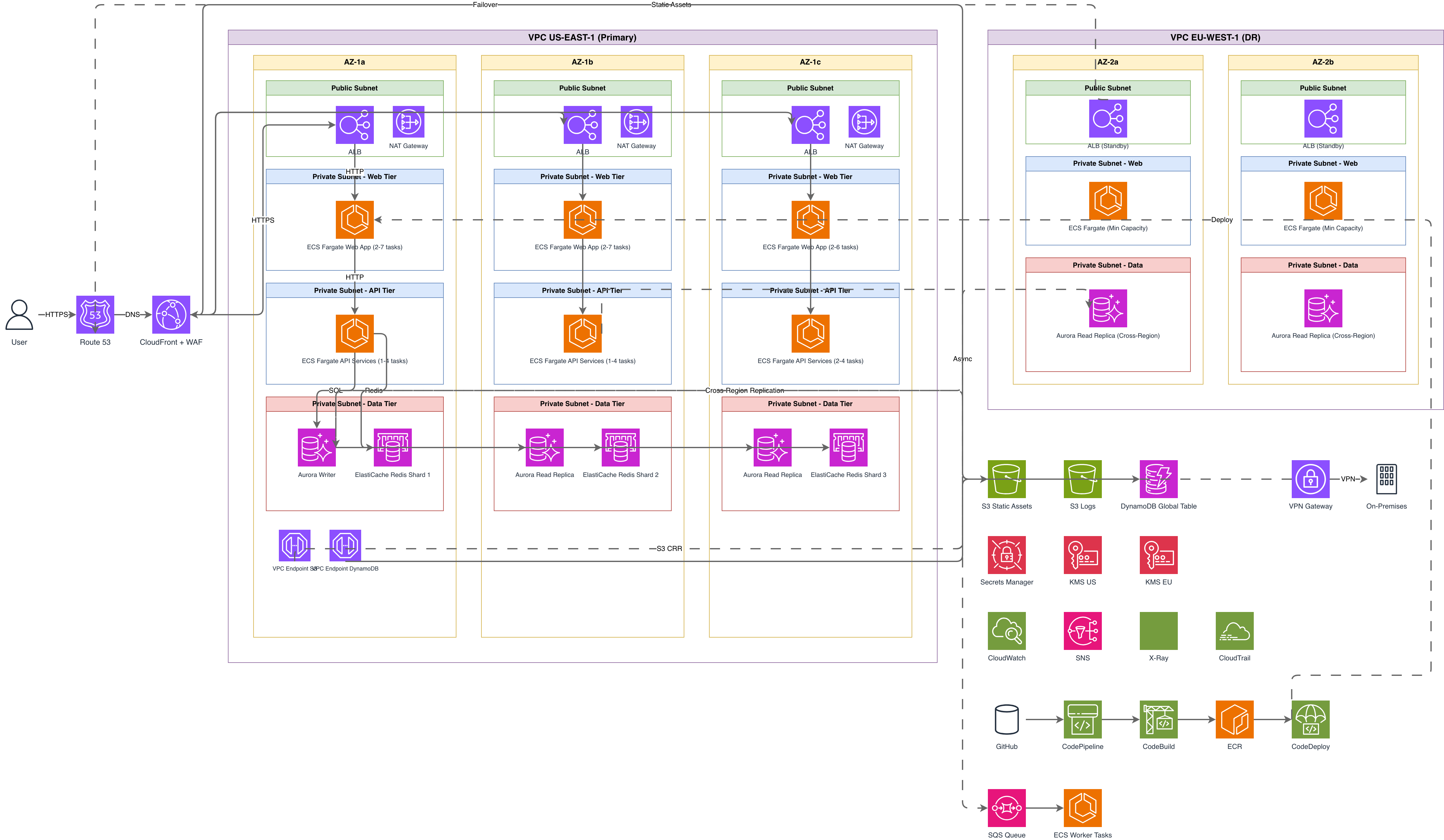
The difference between a useless diagram and one you can present at a design review is about 40 words of prompt specificity. Here are three real prompts and what they generate. Prompt 1: "AWS three-tier web application. CloudFront distribution with S3 origin for static assets. Application Load Balancer in public subnets across us-east-1a and us-east-1b. Three ECS Fargate tasks running behind the ALB in private subnets. Aurora PostgreSQL cluster with one writer and two read replicas in a separate private subnet group. ElastiCache Redis cluster for session storage between the Fargate tasks and Aurora." This generates a left-to-right diagram with CloudFront on the far left, an arrow to S3 and another to the ALB. The ALB sits inside a VPC boundary with two AZ groupings. Each AZ shows a public subnet with the ALB endpoint and a private subnet with Fargate tasks. Aurora appears in its own subnet group on the right with three database icons (one writer, two replicas). ElastiCache sits between Fargate and Aurora. All connections are labeled with protocol hints. Prompt 2: "Event-driven order processing system. API Gateway receives POST /orders, triggers Lambda function for validation. Valid orders go to SQS standard queue. SQS triggers a second Lambda that writes to DynamoDB orders table and publishes an OrderCreated event to EventBridge. EventBridge routes to three targets: SNS for customer notification, another Lambda for inventory update, and a Kinesis Data Firehose for analytics to S3." This generates a horizontal flow starting with API Gateway, branching at EventBridge into three parallel paths. Each Lambda function has a distinct label. The SQS queue shows between the two Lambda functions. DynamoDB appears with a table icon labeled 'orders'. The three EventBridge targets fan out to the right. Prompt 3: "Kubernetes cluster on GKE with Istio service mesh. Ingress gateway routes traffic to three microservices: user-service, order-service, and payment-service. Each service has 3 replicas. Istio sidecar proxies handle mTLS between services. payment-service connects to Cloud SQL PostgreSQL. order-service reads from and writes to Memorystore Redis. All services push logs to Cloud Logging via Fluentd DaemonSet." This produces a diagram with a GKE cluster boundary containing three namespace groups. Each microservice shows as a Deployment with replica count. Istio sidecar icons attach to each pod. Arrows between services are labeled 'mTLS'. External services (Cloud SQL, Memorystore, Cloud Logging) sit outside the cluster boundary with arrows crossing the boundary line.
When AI generation is faster and better than manual diagramming
AI generation wins in four specific scenarios. First, initial drafts during design discussions. When you're in a meeting and someone says "what would it look like if we added a caching layer between the API and the database," you can type that prompt and have a diagram in 10 seconds instead of spending 5 minutes dragging boxes in Draw.io while everyone watches. The diagram won't be perfect, but it anchors the conversation. Second, standardized documentation. If your team needs architecture diagrams for every service and they all follow the same pattern (VPC, load balancer, compute, database), AI generation enforces consistency. Every diagram uses the same icon set, the same layout direction, the same grouping conventions. Manual diagrams drift. One architect puts the database on the right, another puts it on the bottom. One uses the official AWS icons, another uses generic cylinder shapes. AI generation with Diagrams.so uses the official cloud provider icon sets from 30+ libraries, and opinionated mode locks the layout. Third, exploring alternatives. You want to compare a monolithic deployment on EC2 versus a microservices deployment on ECS Fargate versus a serverless deployment on Lambda. Generating three diagrams from three prompts takes two minutes. Drawing three diagrams manually takes an hour. The AI handles layout, icon selection, and alignment for each variant so you can focus on the architectural differences. Fourth, onboarding new team members. When a new engineer joins and asks "how does our payment system work," you can generate a current-state diagram from a description of the actual running infrastructure. This is faster than finding the existing diagram (which is probably outdated) or explaining it verbally. Paste the description from your infrastructure-as-code comments or runbook, and the AI generates a visual representation that matches what's actually deployed.
When manual diagramming still wins over AI generation
AI generation has real limits, and pretending otherwise wastes your time. Manual diagramming is better when the diagram needs to tell a story with a specific visual flow that doesn't follow standard patterns. If you're presenting to executives and you need the "before" state on the left, a transformation arrow in the middle, and the "after" state on the right with cost annotations and risk callouts at specific positions, that's a narrative diagram. AI generates structural diagrams, not narrative ones. Manual wins when the diagram requires precise spatial relationships that encode meaning. Network topology diagrams where physical proximity on the page represents network latency, or data center layouts where position represents rack location, need human spatial reasoning. The AI arranges components for readability, not for spatial accuracy. Existing diagrams that need incremental updates are another case. If you have a Draw.io file with 80 components and you need to add a new service between two existing ones, it's faster to open the file, drag in the new component, and draw two arrows. Regenerating the entire diagram from a prompt risks losing the specific positioning and annotations your team has added over months. Finally, manual diagramming wins for diagrams that mix multiple abstraction levels deliberately. A diagram that shows a high-level system context view in one corner and a detailed subnet-level view in another corner, with a "zoom" visual metaphor connecting them, requires human design sense. AI generates at one abstraction level per diagram. If you need mixed levels, generate each level separately and compose them manually in Draw.io. The .drawio export from Diagrams.so makes this workflow straightforward since you're editing native XML, not a locked proprietary format.
How Diagrams.so compares to other AI diagram tools on portability
Most AI diagram tools output images. You get a PNG or SVG and that's the end of the road. If you need to change a label, move a component, or add a connection, you regenerate the whole thing. Diagrams.so outputs native .drawio XML, which means the generated diagram is fully editable in Draw.io, the VS Code Draw.io extension, Confluence, or any tool that reads mxGraphModel XML. This matters more than it sounds. Architecture diagrams have a lifespan of months to years. The initial generation is 5% of a diagram's life. The other 95% is edits: adding a new microservice, updating an endpoint URL in a label, adding an annotation about a recent incident. If your AI tool outputs an image, every edit requires regeneration or switching to a manual tool. If it outputs .drawio XML, edits happen in the same tool your team already uses. Some AI tools output Mermaid or PlantUML code. That's better than images but worse than .drawio for most teams. Mermaid gives you limited control over positioning and styling. PlantUML requires a rendering step. Neither produces files that non-engineers can open and understand directly. .drawio files open in a visual editor that anyone on the team can use. Diagrams.so also runs architecture warnings against the generated output. WARN-01 flags single-AZ deployments. WARN-02 catches public endpoints without WAF. WARN-03 identifies databases without replicas. WARN-04 detects missing security boundaries. WARN-05 highlights ambiguous components. These warnings appear alongside the generated diagram so you catch structural issues before the diagram goes into a design document. Other AI tools generate the diagram and leave validation entirely to you. The voice-to-diagram feature lets you describe architecture verbally and get the same .drawio output. This is useful during whiteboard sessions where typing a prompt interrupts the flow of discussion. Describe the architecture out loud, get the diagram, project it on screen, and keep the conversation going.
Getting the most from architecture warnings in your AI-generated diagrams
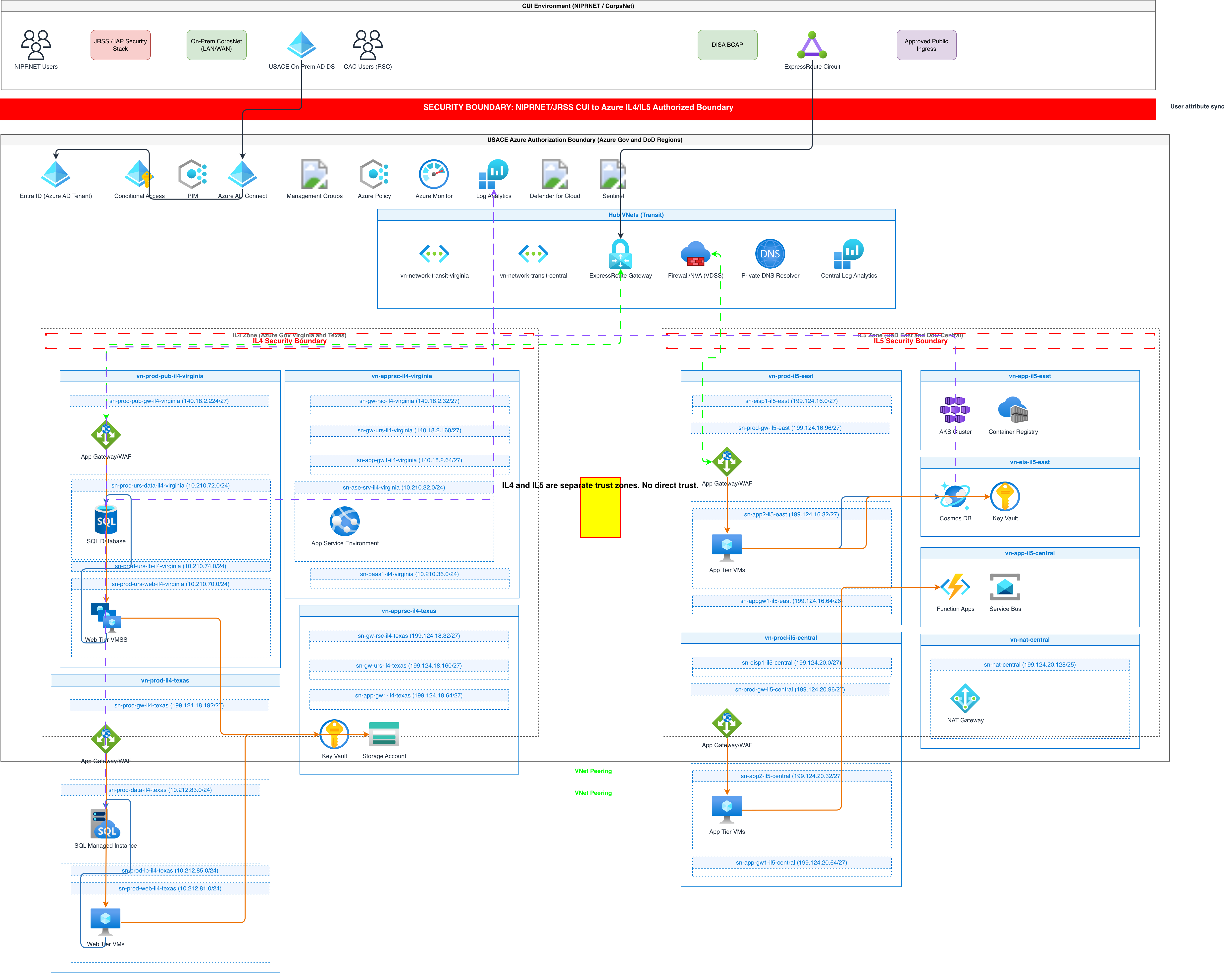
Architecture warnings are the most underused feature in AI diagram generation. They turn a passive diagram generator into an active review tool. When Diagrams.so generates your diagram, it runs five checks against the output. WARN-01 (Single-AZ deployment detected) fires when your prompt describes components in only one availability zone. If you write "ECS Fargate tasks in a private subnet" without specifying multiple AZs, the warning tells you. The fix is adding availability zone information to your prompt: "ECS Fargate tasks distributed across private subnets in us-east-1a and us-east-1b." This changes the generated diagram from a single subnet group to two AZ-labeled groups with tasks in each. WARN-02 (Public endpoint without WAF) fires when your diagram has an internet-facing component like an ALB or API Gateway without a WAF or CloudFront distribution in front of it. The warning doesn't block generation. It flags the gap so you can decide whether to add a security layer or document why it's acceptable for this particular system. WARN-03 (Database without replica) fires when you describe a single database instance. Aurora, RDS, Cloud SQL, or any managed database shown as a single node triggers this. The fix is specifying replicas in your prompt: "Aurora PostgreSQL cluster with one writer instance and two read replicas." WARN-04 (Missing security boundary) fires when components that should be in a VPC, subnet, or security group are floating outside any boundary. This typically happens when your prompt doesn't mention network architecture. Adding "inside a VPC with public and private subnets" wraps your components in the correct boundaries. WARN-05 (Ambiguous component) fires when the AI can't determine the specific service from your description. "A message queue" triggers it. "SQS Standard queue" doesn't. "A database" triggers it. "Aurora PostgreSQL 15.4" doesn't. Specificity in your prompt eliminates these warnings. Treat these warnings as a checklist. Generate the diagram, review the warnings, update your prompt to address each one, and regenerate. Two iterations typically produces a diagram that passes all five checks and represents a genuinely well-considered architecture. The warnings aren't suggestions to make the diagram prettier. They flag structural decisions that affect reliability, security, and operational readiness.
Related diagrams from the gallery


Try these diagram generators
Generate System Architecture Diagrams from Text
Describe your system's components in plain English. Get a valid Draw.io diagram with services, databases, message queues, caches, and API connections.
Generate Cloud Architecture Diagrams from Text
Describe your cloud infrastructure in plain English. Get a valid Draw.io diagram with region boundaries, availability zones, managed services, and DR paths.
Generate AWS architecture diagrams from text
Describe your AWS infrastructure in plain English. Get a valid Draw.io diagram with official AWS icons, VPC boundaries, and Multi-AZ placement.