Submit Button - Multiple States
About This Architecture
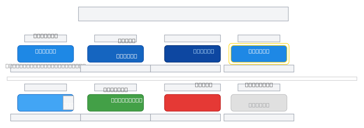
Submit button component showcasing six distinct states—Default, Hover, Active/Pressed, Focused, Loading, and Success—with visual and semantic variations for each interaction phase. Each state uses color progression from primary blue through darker shades, focus rings, and contextual labels to guide user intent and feedback. This pattern demonstrates accessibility best practices including focus indicators, disabled states, and clear error recovery paths. Fork this diagram to customize colors, spacing, and state transitions for your design system or component library. The Loading and Error states include retry mechanisms, making this template ideal for form submissions with network latency or validation feedback.
People also ask
What are all the states a submit button should have in a user interface?
A well-designed submit button should include Default, Hover, Active/Pressed, Focused, Loading, Success, Error, and Disabled states. This diagram shows each state with color, focus ring, and label variations to provide clear visual feedback and accessibility cues throughout the form submission lifecycle.
- Domain:
- Software Architecture
- Audience:
- UI/UX designers and frontend developers building accessible, state-driven button components
Generated by Diagrams.so — AI architecture diagram generator with native Draw.io output. Fork this diagram, remix it, or download as .drawio, PNG, or SVG.