Industries Affected by Fuel Cost - Pie Chart Flow
About This Architecture
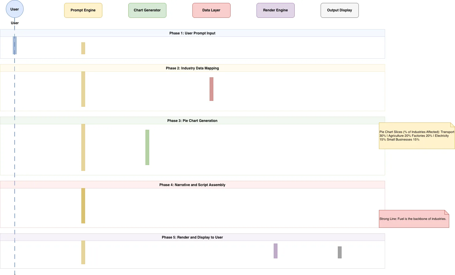
Multi-phase data visualization pipeline that transforms user prompts into interactive pie charts showing industry fuel cost impact. The system flows through prompt processing, industry data mapping, chart generation, narrative assembly, and final rendering to display. This architecture demonstrates how to orchestrate data retrieval, transformation, and visualization in a single user-facing workflow. Fork this diagram on Diagrams.so to customize data sources, add real-time updates, or integrate with your BI platform. The five-phase design separates concerns between input handling, data operations, generation logic, and output rendering for maintainability.
People also ask
How do you architect a data pipeline that generates industry impact pie charts from user prompts?
This diagram shows a 5-phase pipeline: Phase 1 captures user input, Phase 2 maps industry data, Phase 3 generates pie chart slices (Transport 30%, Agriculture 20%), Phase 4 assembles narrative context, and Phase 5 renders the final visualization. Each phase separates data concerns for scalability and maintainability.
- Domain:
- Data Engineering
- Audience:
- data engineers and business analysts building data visualization pipelines
Generated by Diagrams.so — AI architecture diagram generator with native Draw.io output. Fork this diagram, remix it, or download as .drawio, PNG, or SVG.